Category Archives: Art

A debut of sorts

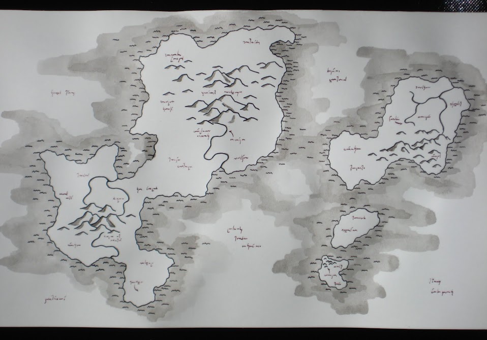
I completed another map over the past few months – and this one has some special distinctions. Namely, it was my first commission and sale! So, be it known that I do that now.

I started from sketch maps, place names, and some stylistic suggestions, but for the most part my own input comes in the artistry and execution. The layout, terrain, and languages are not my own. As I’ve gradually stopped tying maps to my own fantasy world and started drawing them as art for their own sake, it was interesting to put one together based on a set of stories belonging to someone else!

Plains, rocky isles, temperate forests, and ocean

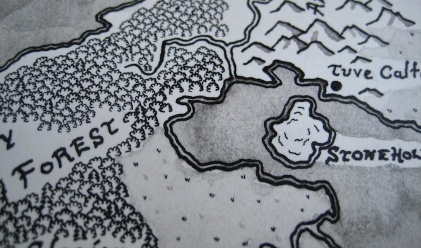
I used the opportunity to try some new(er) techniques, of necessity. I made the decision to do the entire map in black and white, which meant finding ways to distinguish different terrain types with shading and symbols. Grasslands got a light wash, with little grass symbols in two shades. I indicated deserts with a wavy dune-like pattern in very dilute ink. And water took on texture from rough brushstrokes. I also had to have some idea how to handle labels early on (rough though my own lettering may be).

Desert, mountains, and tropics

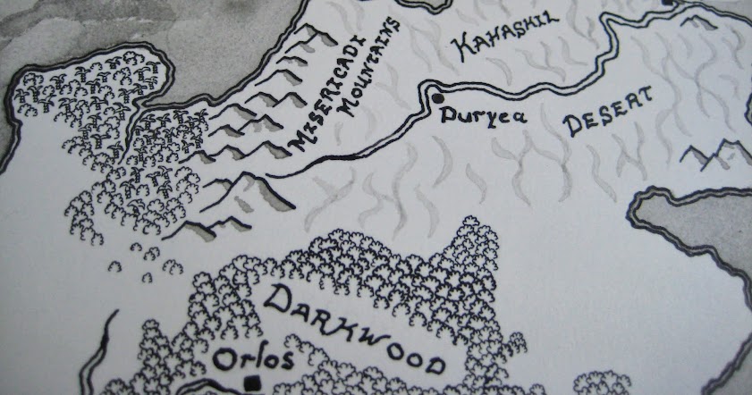
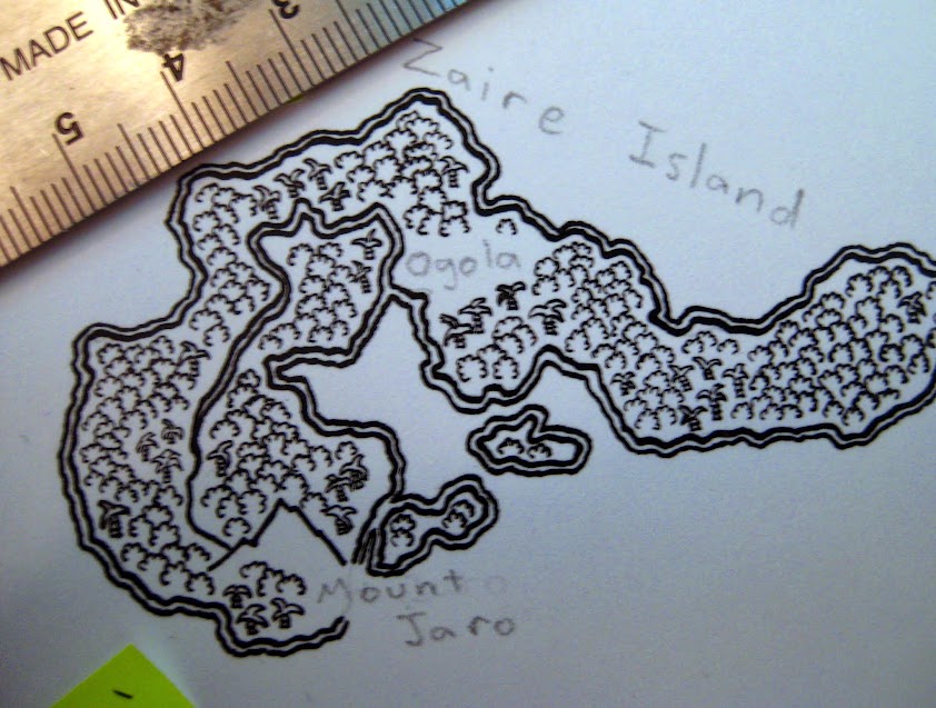
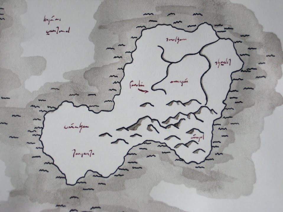
One of the challenges was that this map depicted a region of continental scale. I indicate this by scale: the mountain ranges I drew here don’t reach the heights they do on other maps. I’m particularly happy with the mountains; I think their shapes and shading worked out nicely to give a rough, natural feel to their slopes. The scale of the map also made forests tricky. On a map like Zarmina, I could show forests – and their type – by color. Here, that was not an option. I did some experiments on scratch paper with shading ideas, but in the end I came back to my first idea: tiny trees. Tiny scalloped symbols for deciduous trees, tiny jagged angles for pine trees, and tiny swoosh-topped wedges for tropical palms.

I MEAN REALLY TINY
Seriously. Tiny trees.

This all came about thanks to my discovery that my superfine pen nib was terrible, but I had a second one that I’d never tried lying around. Turns out that one was much easier to control.

The mixed-up tree styles worked very well, giving me a simple mechanic to distinguish different parts of the map and giving this map something (so far) unique, in the way it divides the viewer’s attention from the larger, broader scales to the smaller, more detail-oriented bits. I also learned more about how the ink behaves in washes, and I’m looking forward to manipulating some of those effects in my next personal project – already underway!

This one has a sob story

New map! Here it is, in my studio:

“Archipelago”

This map depicts an island chain, with no particular raison d’être. Hence, no labeled place markers or accompanying glyphs.

I like this one because it contains some of the most careful, subtle, and successful color-shading work I’ve done yet. I think I got more – in terms of both cartographic significance and artistry – out of the coloration than I’ve done with line in many other maps. I spent a good time blending and brushing the watercolors.

Shady islands

In “Archipelago” (because, hey, I think I’ve got to start naming these maps) I spent a significant amount of time on the water, too. Not as much as on the land, mind you, but still – a good fraction of the coloring phase effort went into adding depths to the water and blending the surface together. I wanted to hint at shallows, deeps, and reefs. The lines enhance the effect, with additional shoreline markings hinting at ranks of breakers where beaches slope gently into the sea. The extra coast markings give the impression that you could walk from island to island, getting only your feet wet.

Hopping from place to place and color to color

Many of the same colors that are in the land are also in the water, and vice-versa. Both the mesa tops and the deepest part of the sea have purple in them. The arc of the ocean includes some red and orange – and the grasslands have some blue. In some places, only an ink line and a change of texture (from smoothly blended terrain to the more roughly and unevenly applied waves) distinguishes land from water. There’s a lot of small variation in the colors, bringing out the forests, grasslands, beaches, and stone. There are some lighter ink icons showing regions of thicker vegetation or adding texture to rocky terrain, but for the most part, it’s color doing the lion’s share of the work. This is a bit new: though I’ve been coloring the maps all along, several of my previous maps used color as an enhancer to the ink lines; so far only Zarmina has a similar level of color shading in addition to the ink. I am very pleased with the effect and I think that the map makes a great addition to my growing collection. (I’m up to one in a nice frame, one tacked to the wall in a poster frame, two gifted away, two completed and idling about here somewhere, four works in various stages of slow or rapid progress, and three at the conceptual stage.)

And then I ruined it.

I decided that I needed something else to add focus to the grasslands on the largest island, since most of those regions are yellow and open, and I didn’t want them to appear as deserts. I diluted some india ink to produce a lighter gray ink shade, took out my super-fine pen, and happily added a few regions of hatch marks, with the intention of denoting tall, grassy plains. Amber waves of grain, and all that. Perfectly logical. I was a bit hesitant when I started, but recalling the tremendous success of the inkwash map in a similar situation, I took a deep breath and committed pen to paper.

Plains of sticks? The ground has patchy five o’clock shadow? I don’t know.

Live and learn.


The inkwash map

I have finally finished off a new map to share with everyone!

The inky islands

This is entire ink and ink washes, applied with both pens and brushes. It’s mostly black ink, with a bit of brick red for those cryptic labels.

These mountains are in a new style, too. Their shapes are more blocky and angular, and I provided all the relief with ink wash rather than hatching. The coastline also departs from my previous maps, where I favored a double line with a thicker landward line. Here, the line is no different from any other, but I drew in some icons for breakers and focused the washes on the water side of the line.

close-up

The labels have a sort of funny procedural story to them. They don’t consist of much; simply a few random scribbles with suggestions of ascenders, descenders, and diacritics. I always intended to do something tiny and random rather than making precise characters. What’s funny is that I let this map sit for months between when I finished with the black ink and when I sat down for the quarter hour it took to put in the labeling. In all previous cases, I’ve had something very careful in mind with my labels; this time, I went in wanting to scribble randomly on my map. In ink, that scribbling becomes permanent. (I can scrape off ink with an x-acto knife, but that leaves some slight damage on the paper and isn’t feasible on a large scale.) Eventually, I just had to bite the bullet and see what came out the other side of the process.

Then I could call the map done.

On the World Zarmina

2014 update! You can now buy prints of this map!

…Preliminary report on image data from the LongShot-2 mission…

The planet Gliese 581galso known as Zarmina – is a circular world.

It is not circular in the literal sense shown on ancient maps of the Earth, before we understood Earth to be a sphere. Rather, Gliese 581g spins at the same rate as it orbits its star, so its sun is always in the same place in its sky. Heat from the red dwarf, distributed by the circulation of the atmosphere, keeps a circular region under the star warm enough to melt ice into liquid water.  Thus, the habitable regions fall entirely within a disc under the constant light of the red star. Outside this region, water freezes – and the further one goes out onto the ice, the more inhospitable it gets. Travel to the far side of the planet is about as difficult as traveling from the Earth to the Moon – and so, to the inhabitants of Zarmina, their world might as well be a circle ringed in ice.1

This artist’s concept, based on image mapping from our recent interstellar probes, depicts the habitable region of Zarmina:

Zarmina, from above the substellar point
Zarmina, from above the substellar point.

For discussion of Zarmina, some reference points and directions are necessary. The circular boundary of the map is the ice line: beyond this point, water is certain to freeze. The center of the circle thus defined is the substellar point. When standing here, the red dwarf Gliese 581 is directly overhead. This image shows Zarmina oriented with is orbital plane horizontal. The planet has a south magnetic pole pointing roughly towards the top of the page, and so the “top” and “bottom” of this map become the cardinal directions north and south. East and west take on their usual definitions.

Gliese 581g is approximately three and a half times the mass of Earth. It is tidally locked to its star, meaning that one side always faces its Sun just as one side of the Moon always faces the Earth. Gravitational tides from the star also have the effect of pulling the rocky surface of the planet into an oblong shape, like a rugby ball. Since our probes reached the Gliese 581 system,2 we determined that the planet has a tiny orbital eccentricity (from perturbations by the other planets in the system) which causes a periodic shift in the gravity force on the planet: slightly east to slightly west, and back again, every Zarminan day (about 37 Earth days). The combination of the periodic variation in stellar tide and the fact that the ocean is more mobile than rock makes dry land much more common in the center of the disc than near the edge, as we see in the map.3

This variation in tidal force results in one of Zarmina’s most striking surface feature types. Continue reading On the World Zarmina

Fantastic Cartography Again

I know I’ve liked to draw fantastical maps for a long time now. So, I should not have been surprised at how much fun I had producing a fancy version of a map for a world I’ve been working with for several years. I figured out techniques for drawing the shorelines, forests, and mountain ranges that I think were very successful. I used a lot of watercolor pencil washes, with india ink for lines.

Map of the Southern Continent

Still, though I like it as an image, the product isn’t a perfect map. I made the decision to try and put in all the physical features before any points of interest of placenames, with the intention of doing so in an overlay. None of my scratch tests for such labels worked very well; I ended up putting labels on the map in postprocessing on my computer. Not ideal, but at the same time, it came out okay.

I had such a great time producing the map over the course of a couple of weeks worth of coming home from work, making dinner, and then throwing NPR on while I sat down with my pen and ink. (It was a very meditative sort of endeavor.) I have also been keen on trying to improve the map. Fortunately for me, Fiancée loved the thing and requested that I produce a similar map based on a template which she supplied to me. Well, then. I didn’t need a second excuse to start.

Map of Faerie

I worked primarily from the template; but I had leave to make some modifications such as putting detail on coastlines or changing river courses to be more realistic. I stuck with the same general techniques that worked so well for me on the first map.

This time, though, I planned a bit better. I noted the positions of the physical features; but I also included the major landmarks and indicated to myself where text labels would go. When I inked in the forests and mountains on this map, I left myself spaces for the labels. I practiced ink lettering on scrap paper, came up with a font style that I thought would be fitting, and this time put hand-lettered placenames directly on the paper.

A nicely labeled forest

I will be the first to admit that I didn’t succeed in all instances – this paper absorbed the ink in a very different way depending on whether there was a good base layer of pencil in place – but I like the results, in general. You can also see that this time I have added some carmine red ink to my repertoire, to add accents or denote features on the map (here, provincial boundaries from the template map). Another set of new features comes from a few special points of interest on the map. I will comment that inking a small symbol, such as crossed swords, on a large paper map comes with a particular set of challenges: ink is almost impossible to remove without leaving evidence, and so once I set about drafting such a symbol on the final image, I was committed to it! After all, I’d hate for one badly botched, critical item to ruin the whole work. (Happily, little goofs in the mountains and such simply add to the character of such an image!)

City and Battlefield

Just for grins, I threw on some other embellishments around the coastlines. You know: sea monsters and such. I’m particularly happy with this little guy.

Big fish

I still have the map in my apartment and I’m thinking about whether I should add some kind of border, but I think I’m just going to let Fiancée mat and frame it however she likes.

Now I’ve just got to think about what cartographic project to do next…

The Map

I have come into the possession of a most extraordinary object, which I procured rather fortuitously before the auction of goods from an insolvent boutique on the East Boulevard. I do not know how long it lay, disused and uncared-for, in a dusty drawer at that establishment, or when the boutique acquired it. The artifact in question is a curious map of the southern continent. I have scrutinized the place names and cross-referenced the markers corresponding to cities and towns with the atlases and charts in the City Library, and I have determined that this map dates from approximately 530 A.E. It covers the area from the North Barovin Mountains in its upper-left extremity, to historic Vorsvenbal in the south and all of South Brenin, Kalatchal, and part of Olahira to the east.

The dòm Gurand Map

The famous dòm Gurand Map of our southern continent does not only provide interesting historical and societal context, but contains some surprisingly accurate geographic information. One can examine the map for geological purposes, for evidence of historical wind patterns, and for characteristics of the climate of the year 530. Drainage areas of rivers are readily apparent, for instance, and the cartographer has captured some of the different qualities in the mountain ranges. Continue reading The Map

Art Question: Map Labels

I have been working on a map. It looks something like this:

Map Detail

The map consists of India ink laid down on top of a set of watercolor washes. (Well, technically, washes from some Derwent Signature Watercolor pencils – thanks to Robin for those!) This is actually my first excursion into something like this. I like the way the India ink sits on top of the paper, while the watercolor soaks in.

But now I have a dilemma: I’m trying to decide how, or even if, to label the map with place names. I have already digitized the map (eh, roughly…what I really need is a large-format scanner!) and have been playing around with labeling schemes on the computer. The easiest and clearest thing to do in digital form is to (at least partially) desaturate the map such that the colors are duller and the ink is perhaps 60% gray and then scrawl my labels over it. However, the physical map has fairly bright colors and the ink is, of course, nearly always black, which means that a sweeping label over those mountains or forests will not come out well. I think more experienced cartographers of fantastical lands than I would have done the labeling and the cartography simultaneously, so they could shape the trees and mountains around the words if necessary. But no, I had to go ahead and ink in all the forests and mountain ranges first.

Here is what I am wondering: if I get some, say, red ink and use my pen to write a sprawling label over one of those forests, will the ink sit on top of the black-inked trees and be generally legible? Clearly, doing that with black ink would result in an unreadable jumble, but would red cut across the existing features with enough contrast? Should I just stick with doing it all by computer? Or does anyone out there have a better idea?