The Cathedral Galaxy setting is now complete with a full set of regional maps, each highlighting a particular area of the galaxy and an aspect of the setting. Extra lore and artwork are scattered throughout, in addition to the larger overview map and establishing descriptions of each region posted here. Enjoy!
My next step is writing a story in this galaxy. I will not make any statements on how long that will take!
In addition, I’ve had a few people ask me about setting role-playing games in the Cathedral Galaxy. That idea intrigues me, and I’m happy to learn that players are interested in using my universe for their games. So, I have put together some lore and gameplay reference materials that you may use. Click through to read more.
The Cathedral Galaxy: so named to evoke an awe-inspiring structure; something built over generations. Eons before the advent of starflight, the Ancients – Progenitors, Precursors, Archaics, Elders – constructed a galaxy-spanning civilization. They learned to harness energies, manipulate matter, and gather information on a vast scale, ultimately building a network of wormhole passages across the galaxy. At the height of their power, they encountered a malevolence from outside the galaxy: some think an evil intent, some say a natural phenomenon. Nobody yet knows what happened to the Old Ones. Perhaps they died. Perhaps they absconded. Perhaps their essence remains embedded in the constructs they left scattered through the galaxy – some still functioning at mysterious purposes, some long torn down by the forces of gravity and radiation. Perhaps the Elders even remain alive. After all, ages after empires have risen and fell and risen again, no one has penetrated the dense, irradiated Cathedral at the galaxy’s heart.
The Cathedral Galaxy map
Thousands of years ago, the first modern peoples discovered the principles of spatial trajection. With this starflight capability, a ship could disappear from normal space and, a fixed time interval later, reappear some light-years away. They soon found ruins of the Prior civilization. Eventually they located the Founders’ great Anchors, entry points to the wormhole network, providing instant transit – much better than time-consuming and energy-intensive trajector jumps. Many other peoples followed suit, and the wormhole passages thus became channels of commerce and information allowing galactic civilizations to be built again. Through their history, the peoples of the galaxy have always been keenly aware of those who came before – and all that has been lost, exemplified by the nonfunctional wormhole gates drifting near many of the active Anchors. Now, the galaxy has reached a relatively stable state. Decadent empires, considered republics, brave adventurers, learned researchers, inventive scavengers, and noble warriors make their home in this galaxy, from the populous core nations to the empty frontier fringes.
It is a galaxy of both promise and stillness at this moment in time. After eons, what is an extra nova in the uninhabited core? What is a rumor of new Anchors opening, or existing Anchors closing, but a rumor? And what is an archaic megastructure activating instruments, seeming to seek for something outside the confines of the galaxy, but a relic running an obsolete program…?
Original line art
I have been mulling an improved map of the Cathedral Galaxy for some time, and finally bit the bullet. (Here’s the original.) For this improved and expanded version, my method was to draw the line art in black pen on white paper, then invert a photograph and color/manipulate it in Photoshop. I’m pleased with the result.
Amseile, a proud young realm nestled in two star-forming nebula regions. After uniting from several independent systems in 18k450, Amseile fought a devastating war with Shobah with lasting effects on galactic politics to this day.
The Axiom Republic, a large, baroque state of learning and cultural achievement. The Republic’s central location in the galaxy means that it contains many Precursor artifacts such as the Spire and Taron’s Throne, as well as celestial phenomena like the emission nebula Twin Idols, dust clouds of Onyx Space and Silver Run, the active Sapphire cluster, and the end-of-life star Khalkeus that sheds heavy elements.
Harrow’s Core, home of two enigmatic peoples who believe, among other strange ideas, that the galaxy itself is a living organism. There are rumors that a secret and powerful Archaic weapon prevented other polities from absorbing the Core during their expansionary phases.
The realms of what the core nations call the Exiles, nearly cut off from the rest of the galactic network by a quirk of the arrangement of wormhole passages: Babylon, a decadent theocratic empire; the Free Worlds, a xenophobic and militant confederation; and the Underworlds, domain of a people stereotyped by the rest of the galaxy as the Dead Ones – according to one legend, the last of the Ancients, but robbed of their faculties. The Panther Nebula, a dust cloud with an obviously recognizable shape from throughout the Burial Grounds, signals adventurers away from this region.
The Far Reaches, a spiral arm of the galaxy with a sparse population but many lesser Elder relics.
The Imperium of the Triumvirate, once a vast empire, now reduced to three closely allied provinces each under its own despot: technologically advanced, aggressive, and lacking restraint. The Imperium’s skirmishes are not always with other nations. Aoreu is known for the exotic star-forming Menagerie, but the true symbol of the Imperium is the Coliseum, a Progenitor-built sphere surrounding a white dwarf, where biomechanically modified beings battle for citizens’ amusement.
The Mariner Worlds, a loose affiliation of wanderers, not all native to this sparse region or even to the galaxy itself. Among these worlds are Harbor, a focusing construct partially surrounding an unusual dwarf star that appears on the verge of collapse to a neutron star; Haven, a resource-rich protoplanetary disk; and the Lighthouse, an array of transmitters and instruments aimed into the extragalactic medium.
Shobah, a nation of rigid structures and protocols, home to a sect of Librarians who believe that the Ancients discovered all knowledge it is possible to find, and therefore focus all research on the ruins scattered throughout the galaxy. Knowledge gleaned from the Ancient wrecks helped Shobah fight off Amseile’s incursions in the war.
The Traders’ Rim, where the layout and performance of the Channel Anchors make the region vital for speeding commerce and communication among the central galactic states from the Imperium to Shobah. Traders are some of the few people grudgingly accepted into the Free Worlds, making them a tenuous link between that region and the inner galaxy. Prominent landmarks in the Rim include the blue giant Azure, the black hole Point of No Return, and the planetary nebula Mokid’s Eye.
The Ramparts, filled not only with ancient artifacts from the First Ones, but also with the remains of several civilizations that died out before contact with others.
The Sea of Relics, a span with a high proportion of Elder artifacts – many of them still functioning, such as the cryptic information repository at Bastion. Radiation from the active jets of The Pillar keep this region relatively uninhabited. The Burial Grounds, on the other hand, collects fragmented wrecks of Archaic constructs after gravitational tides and cosmic radiation have weathered and broken them down.
The Well of Ghosts, a devastated region scattered with burned worlds and detritus from the Amseile-Shobah wars. It stands as a monument to the terrible power of starflyers’ weapons.
Not all peoples of the galaxy are rooted to a location. The Waygehn had the misfortune of evolving close to the end of their star’s life, and are now spread throughout the Axiom Republic, Traders’ Rim, Imperium of the Triumvirate, and Amseile to form their own political super-entity. Many Waygehn located functional-but-inert relics and retrofitted their own systems onto the ancient hardware to form great arkships and wandering space stations.
In honor of its tenth anniversary online, the Cartographers’ Guild ran a project to map a large, collaborative world. Each participant contributed a map of one country, done in whatever style they chose and with whatever lore they chose. Some of us compared notes with our neighbors to negotiate trade routes and such. Here is my contribution, the Maucland Confederacy!
I took inspiration from my native New England for the names, landforms, and cultures on this map. I’m particularly proud of “Poscadia” and “Quinnameg!” The names along the border are my neighbor countries. (While I was on the other side of the globe from the Fromage War, I enjoy good relations with Janantara Elubor and the Kingdom in the Clouds.)
I am quite pleased with this pen-and-watercolor-pencil map. The colors came out richly, the overall theme holds together nicely, I was able to experiment with some more map elements than I have previously, and I completed the whole project end-to-end in a month, which makes it my second-fastest map after Abrantoc!
I’ve just completes a couple tweaks to the main web site associated with Quantum Rocketry, with the goal of bringing my cartographic artwork more front and center. Note that:
I take commissions! And I would be willing to sell some existing original pieces. (Really! It’s not all spacecraft engineering with me.) Got a fantasy novel, RPG, or just a private world you want depicted in hand-drawn style?
The world known to humankind as Zarmina (catalog identifier Gliese 581g) is a habitable planet orbiting a red dwarf star. It is tidally locked to its dim sun, such that one face of the planet always points toward the sun. The most striking consequence of this orbit geometry is that the habitable region of the planet is a disk-shaped area roughly the size of an earthly continent. The center of this zone always sees a sun at high noon, while toward the edge of the disk, the sun sinks gradually away from zenith. Outside this region, Zarmina is encased in ice. As the sun does not define east and west, the cardinal direction convention on Zarmina refers to the planet’s orbit, instead: prograde (in the direction of the orbit), retrograde, normal (up from the orbit), and antinormal.
Zarmina does not exhibit evidence of plate tectonics. Surface features express several processes: large-scale rift graben form from tidal stresses, shield volcanoes build over mantle hotspots, impact craters and basins dot the planet, and erosion slowly whittles down the more ancient features.
The world hosts life with biodiversity similar to the Earth. One dominant intelligent species has settled across the landmass, with cultures reaching technological development levels roughly equivalent to 1300-1600 CE on Earth. There are three regions with large populations, indicated on the map in normal-retrograde (NR), antinormal-prograde (AP), and normal-prograde (NP) callouts. In the four major language families of Zarmina, the natives call their world Hámnù, Pedak, Gaustan, or Estivama.
The NR region hosts two major linguistic and cultural families. The first is an empire ruled from the city of Hòmp Sīnkà (Port Sinka). Explorers and artisans populate this empire; though the political extent of the empire only reaches as far as Níngtòhús (Greencliff), speakers of the imperial language can be found all along the coast in the prograde direction as well as in coastal settlements on the other side of Fíkùm Pòst (The Normal-Direction Sea). The antinormal borders of the empire are more ragged and contentious, however – the imperial urge to spread its vision of culture and knowledge brings it into direct conflict with the city-states in that area. The people of Kivod Sev Adoso (Mountain Gate Town) dominate the substantial resources of Sev Skem (Mountain Channel) and have repelled several campaigns launched from Hútpòkā (Chasmtop). Hòmp Sīnkà rapidly loses its stomach for these campaigns, and so Kivod Sev Adoso holds back imperial expansion. A more fluid and contentious collision of cultures occurs in Pasken Gimet (Pasken Forest). Scattered settlements under the command of local chiefs raid imperial populations farming antinormal of Ngùsì Āmā (Wide River) while imperial reprisals prevent the Pasken peoples from incorporating large towns. The disparate kindgoms of Ogjapud (Grayrock), Katofa Petang (Retrograde City), and Fetva Zand (Calm Peninsula) maintain their own set of animosities and alliances.
The plains of the AP region offer little shelter from the winds that blow in off the ocean. As the land rises, larger and larger plants cover the land until one encounters lush prairies between dendritic river networks. Roaming clans live on the prairie “kidan.” A few large settlements dot the kidan, most notably Jung a Uid Nakaun (the City of Two Rivers). The kida clans take pride in not pinning themselves to a particular place – many of their dwellings are portable, and they happily move their crops to new locations on the fertile plains when they tire of the old. The culture is leery of townfolk. The Ushtin clan is a splinter from the kida clans, and is more attached to their resource-rich homeland on the shore of Gaiju a Shai (Lake of Wind). On the other end of the cultural spectrum, the dramatically different Togui a Awaish (Chasm of the Forest) hosts a sect worshipping the sun god Dautwai. This sect possesses the settlements of Santiso (roughly, Above-the-Green) and Uigonja (named for the uigon trees), as well as a major urban center in Jung Togunau. From the isthmus of the Nakau Dautwai, dramatic views of the Audos a No (Mountain of the Sun) have inspired monuments throughout the city. The natural defenses of Togui a Awaish shield the people within from raiding kida clansmen.
Lush lands and geographic barriers squeezed into a comparatively smaller area give rise to the warring city-states of the NP region. Though they share a common linguistic root, each of the population centers here represent separate nations. The largest are Evinbok and Neka Estag, both named for their original monarchs. Evinbok holds a position of strategic strength, with access to productive outlying farmland in Pantma Zhusti (the Upper Plains), while timber and easily quarried rock are in the ancient impact basin of Gesta Kazi (Broken Bowl). Kagzai (roughly, Blue-ton) and Ka Topi (Lower Town) are notable for practicing a form of representative democracy. Ka Shata Besi (High Cliff Town) is the center of a prosperous small nation of traders, who build ships from the timber of Tifa ko Pantma Shti (Forest of the Red Plain) and sail through Vimna Shti (Red Pass) as far antinormal as Sot Ushtin.
This map is hand-drawn with Pigma Micron pens of various types, then colored in Derwent watercolor pencils. I finish the map by painting over the pencils to blend and soften the watercolors together. The last step is photographing the piece with a 60 mm macro lens. The entire thing is 17″ wide and 14″ tall.
The culture of this world is having a bit of a renaissance: they are discovering frontiers of architecture, science, commerce, and engineering. The terrain of rolling hills gives way to basaltic columns – which the cartographer emphasizes, likely beyond plausibility, as an artifact of this renaissance. Those columns shape the flow of nearby waterways. Scattered around the region are representations of monuments and landmarks: the White Palace, the Water-Whele, the Observatorie, the Derrick, the Beacone.
I’ve had this idea lodged in my head for a while, to do a map along the lines of, oh, every hexagon-dominated sci-fi map ever. I wanted to caricature the Giant’s Causeway, and I had the goal of using the hexagonal columns to play with the flow of water. That turns out to be only a minor feature of this map, playing second fiddle to the color. I’m particularly happy with the color blending I got in the peninsula just below center-left. The labels are something I’ve done before, incoherent scribbles that try to give the impression of glyphs, but pushed further than I’ve done before to include bullet lists and parenthetical notes.
Wernher von Braun is one of the lions of the early American space program: a pioneer who engineered our initial forays into orbit, our steps onto the surface of the moon, and our designs for space stations and Martian colonies. He developed or directed the development of the technology to enable those feats. Without him, the United States might not have a space program as we know it.
But all technology is only as good as the people who use it. If von Braun had a personal failing, it was being willing to embrace the use of his devices for nefarious purposes, so long as he could work on them at all. His part in aerospace history began in Nazi Germany, with slave labor and vengeance weapons. Then, after he surrendered to the Americans, he secured a place at the US Army not by promising it the moon – but by promising it the intercontinental ballistic missile. The dual use of this technology was not lost on von Braun. As he famously said of the V2, “the rocket worked perfectly except for landing on the wrong planet.” Since then, every single government to come into contact with von Braun’s work has first thought not of space exploration, but of ballistic missiles armed with weapons of terror.
Two worlds. The reckless denizens of Brawn choose to use their technology for destructive ends. In their insecurity, they ultimately realized their driving fears. Now, all that remains of them is technological detritus: shattered pipelines, broken chain-link fences, and cracked bunkers; all are monuments to warnings ignored.
On another world, the policymakers kept their engineers focused on exploration, enriching and enhancing their culture. They ultimately landed an expedition on the neighboring planet Vhonn – a place harsh in its alienness, but full of scientific treasure troves, including keys to understanding life as they knew it. Their citizens are confident and inspired. They strive forward into the cosmos, and will eventually stake claims throughout their star system.
Today was once celebrated as Armistice Day, a day when the world laid down its arms to end the greatest war it had ever felt – a war that saw the development of weapons so terrible that an international convention gathered to forbid their use. Now, nearly a quarter-century after the end of the Cold War, may we do so again. I hope that, one day, we live in a nation worthy of our veterans’ sacrifices.
Hey there, anybody who has been a fan of my maps! I am proud to announce that I’ve uploaded 18 megapixel images of several of my favorite maps to Imagekind so that you can buy prints.
Prints of Archipelago, Zarmina, and Legends!
There are four maps available: Zarmina, Inkwash, Archipelago, and Legends. I’m pleased with how they came out! Of course, the tiny features on Legends are much better in the original…
Personally, I like the “small” size for the full images, and the smallest size Imagekind offers for the two details. The large sizes, and above, are an up-sizing from the original, and while I’m sure they will make a fine image, I don’t know that the smallest of my details will scale well digitally.
I’m looking forward to the experiment to see how much interest people have in these maps! I can tell you that I’ll be posting more, and I’ll be uploading them to Imagekind as I do.
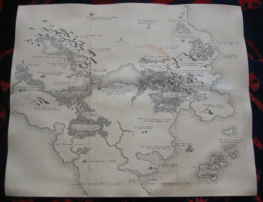
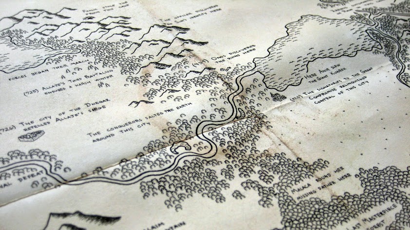
I wanted to try drawing a map full of labels, but no place names. Instead, I would fill it with events and stories suggestive of the cultures living in the lands I depicted. This is the result:
The Map of Legends
Much of the importance we place on a location comes from the stories associated with it. So, this map is covered in people and actions identified with places. Their struggles and triumphs fill the lands, drawing us into chains of associations.
Here camped Lastos’ army on the eve of battle. Sfola’s Last Masterpiece depicts this forest. Foalic stole the Emerald Shield from this cave. Here was the site of the Second Arbiter’s Congress – possibly related to the Fishers’ Revolt, the first shots of which were fired in this nearby village.
Lands of Allaje and Malaca
Looking at the labels, you may notice that roughly half of them have a preceding number in parentheses – what might appear to be a year. These labels speak of military campaigns, scientific exploits, political victories, founding of religions, and significant personages. The other half, without a corroborating date stamp, mention more dramatic exploits: giant creatures, heroic duels, stolen artifacts, and encounters with the supernatural. Are these myths of the local culture? Or do they hold some kernel of truth? Continue reading Legends and Histories→
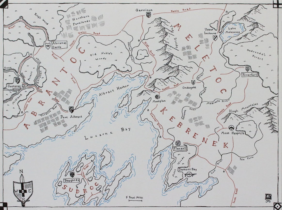
I completed another map over the past few months – and this one has some special distinctions. Namely, it was my first commission and sale! So, be it known that I do that now.
I started from sketch maps, place names, and some stylistic suggestions, but for the most part my own input comes in the artistry and execution. The layout, terrain, and languages are not my own. As I’ve gradually stopped tying maps to my own fantasy world and started drawing them as art for their own sake, it was interesting to put one together based on a set of stories belonging to someone else!
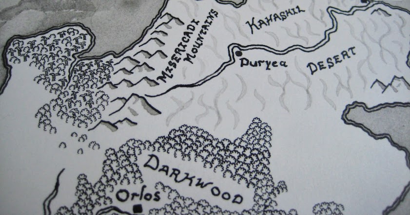
Plains, rocky isles, temperate forests, and ocean
I used the opportunity to try some new(er) techniques, of necessity. I made the decision to do the entire map in black and white, which meant finding ways to distinguish different terrain types with shading and symbols. Grasslands got a light wash, with little grass symbols in two shades. I indicated deserts with a wavy dune-like pattern in very dilute ink. And water took on texture from rough brushstrokes. I also had to have some idea how to handle labels early on (rough though my own lettering may be).
Desert, mountains, and tropics
One of the challenges was that this map depicted a region of continental scale. I indicate this by scale: the mountain ranges I drew here don’t reach the heights they do on other maps. I’m particularly happy with the mountains; I think their shapes and shading worked out nicely to give a rough, natural feel to their slopes. The scale of the map also made forests tricky. On a map like Zarmina, I could show forests – and their type – by color. Here, that was not an option. I did some experiments on scratch paper with shading ideas, but in the end I came back to my first idea: tiny trees. Tiny scalloped symbols for deciduous trees, tiny jagged angles for pine trees, and tiny swoosh-topped wedges for tropical palms.
Seriously. Tiny trees.
This all came about thanks to my discovery that my superfine pen nib was terrible, but I had a second one that I’d never tried lying around. Turns out that one was much easier to control.
The mixed-up tree styles worked very well, giving me a simple mechanic to distinguish different parts of the map and giving this map something (so far) unique, in the way it divides the viewer’s attention from the larger, broader scales to the smaller, more detail-oriented bits. I also learned more about how the ink behaves in washes, and I’m looking forward to manipulating some of those effects in my next personal project – already underway!


